An entryway is never just the place where keys land and shoes come off. It is the first pause, the first impression, the first quiet signal of how the rest of the home might feel. And when that space is painted dark green, it can shift from a simple pass-through into something far more considered a small architectural moment with weight, atmosphere, and confidence.
Dark green has a particular strength in entryways because it does not try too hard. It can feel traditional without becoming stiff, dramatic without shouting, and earthy without looking unfinished. In the right shade, it brings the outdoors in, softens hard edges, and gives even a modest foyer a sense of arrival. That is where dark green earns its keep. It makes a space feel designed rather than merely decorated.
The best dark green paint colors for entryways are not always the deepest or most dramatic ones. The right choice depends on light, flooring, trim, ceiling height, adjoining rooms, and the mood you want to create when someone steps through the door.
Why Dark Green Works So Well in an Entryway
Entryways often have an awkward job. They are usually small, busy, and visually connected to several other rooms. Some have beautiful natural light; many do not. Some are generous foyers with staircases and original millwork, while others are narrow apartment corners trying to carry the weight of storage, coats, bags, and daily traffic.
This is exactly why dark green can work so beautifully. Instead of fighting the limitations of the space, it embraces them. A pale color in a dim hallway can sometimes look tired or chalky, especially when the light is weak. A deeper green, on the other hand, can lean into the shadows and turn them into atmosphere. It gives the space depth instead of pretending it is larger than it is.
There is also an emotional quality to dark green. It feels grounded. It has roots. It suggests gardens, old libraries, painted doors, heritage homes, and quiet rooms where every material has been chosen with care. That kind of color does not blow in with the wind and disappear next season. It has staying power.
Start With the Light, Not the Paint Card
Before choosing a dark green paint color, look carefully at the light in your entryway. This step matters more than people think.
A bright entryway with windows or glass in the front door can usually carry a deeper forest green or blue-green without feeling heavy. The natural light keeps the color moving throughout the day. Morning light may make it look fresher, while evening light can pull out its moodier side.
A darker entryway needs a more careful hand. That does not mean you should avoid dark green. In fact, a windowless or shadowy entry can look incredibly elegant in a deep green. But you need to choose a shade with enough softness in the undertone. A blackened green can feel tailored and expensive, while a green that is too saturated may suddenly look harsh under artificial light.
Artificial lighting also has a say in the matter. A cold ceiling bulb can make dark green look flat or severe. Warm wall sconces, a lantern-style pendant, or even a small table lamp on a console can completely change the story. Paint and lighting are never separate decisions; they work hand in glove.
The Best Types of Dark Green Paint Colors for Entryways
Deep Forest Green
Deep forest green is the classic choice. It feels settled, elegant, and quietly grand. This shade works beautifully in traditional homes, cottages, townhouses, and entryways with paneling, picture rails, or older architectural details.
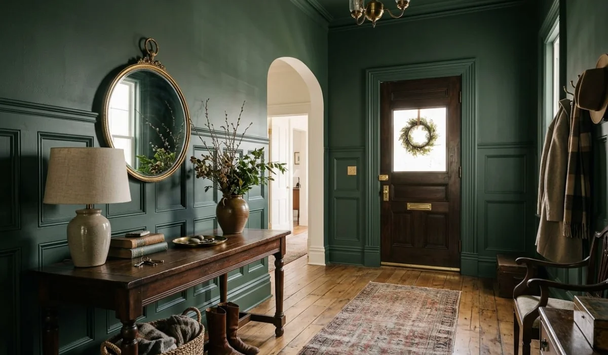
Forest green pairs well with warm white trim, antique brass hooks, walnut furniture, vintage mirrors, and natural fiber runners. It has enough richness to feel special, but it does not need constant styling to look complete.
In real homes, forest green is especially useful when the entryway needs character. If the walls are plain and the architecture is not doing much heavy lifting, this color can add instant depth. It gives the room backbone.
Blackened Green
Blackened green is for a more dramatic, high-end entryway. It sits close to black but keeps that green undertone running beneath the surface. The result is bold, polished, and very architectural.
This kind of green works well on all four walls, on interior front doors, or on built-in storage. It is particularly strong in small foyers because it turns the space into a jewel box rather than a forgotten corner. That may sound counterintuitive, but sometimes going darker is the smarter move. Trying to make a tiny entry look bright with a weak neutral can leave it feeling unfinished. A blackened green gives it purpose.
Pair it with stone flooring, ivory walls nearby, aged brass, black metal details, or a sculptural mirror. Keep the styling clean. This color already has presence, so there is no need to gild the lily.
Olive Green
Olive green is warmer, earthier, and more relaxed. It is the dark green for homes that want depth without drama. It works especially well with oak floors, terracotta tile, clay pottery, linen lampshades, woven baskets, and bronze hardware.
An olive-toned entryway feels welcoming rather than formal. It also transitions beautifully into living rooms, kitchens, and open-plan spaces with warm neutrals. If the rest of the home includes cream, beige, tan, rust, brown, or natural wood, olive green often feels more harmonious than a cooler blue-green.
This is a good choice for family homes too. It hides marks better than pale paint, feels forgiving, and does not look precious. It is refined, but it can still handle real life.
Grey-Green
Grey-green is ideal when you want a dark green entryway that feels calm and sophisticated rather than dramatic. It has a muted quality that makes it easy to live with, especially in narrow hallways or homes with a softer palette.
This shade works well with soft white walls, pale stone, aged nickel, simple wood furniture, and tailored lighting. It can suit both modern and transitional interiors because it does not lean too rustic or too formal.
Grey-green is also helpful when the entryway connects visually to multiple rooms. It gives color and depth without creating a hard stop. The effect is quiet, composed, and easy on the eye.
Blue-Green
Blue-green brings a moodier, more polished edge. It can feel heritage-inspired, coastal, formal, or modern depending on the materials around it. With crisp white trim and brass hardware, it feels sharp and classic. With black doors and marble flooring, it becomes more dramatic.
The one thing to watch with blue-green is how much it shifts. These shades can look rich in daylight and almost teal under certain bulbs. Always test a large sample near the front door, not on a random wall in another room. Small paint chips have a habit of telling half-truths.
Where to Use Dark Green in an Entryway
You do not have to paint every wall to make dark green work. Sometimes the best application is more focused.
Painting all four walls creates an immersive, cocooning effect. This works beautifully in small vestibules, older foyers, or spaces where you want a strong sense of arrival. When the ceiling, trim, and walls are handled with intention, the room can feel incredibly complete.
Wainscoting or lower wall paneling is a more practical route. Dark green on the lower half of the wall protects the area that takes the most wear while keeping the upper wall lighter. This is especially useful in family homes where bags, shoes, pets, and coats are part of the daily rhythm.
The interior side of the front door is another smart place to use dark green. It creates a focal point without requiring a full repaint. Add brass hardware, a patterned runner, and a slim console nearby, and suddenly the entry feels pulled together.
Built-in storage also looks wonderful in dark green. A mudroom cabinet, shoe bench, or hallway cupboard can feel far more custom when painted in a rich green instead of default white. The color gives functional joinery a sense of weight and permanence.
Choosing the Right Trim and Materials
Trim can completely change how dark green feels. Warm white trim softens it and makes the entryway feel inviting. Crisp white trim creates sharper contrast and a more formal look. Matching the trim to the wall color gives a designer-level finish because it removes visual breaks and lets the architecture read as one clean volume.
Materials matter just as much. Brass and bronze bring warmth. Oak and walnut add natural depth. Stone, marble, slate, or checkerboard tile can make the space feel more established. A jute runner or woven basket keeps the look from becoming too stiff.
This is where many entryways either sing or fall flat. Dark green paint needs supporting players. It does not want clutter, but it does want texture.
Common Mistakes to Avoid With Dark Green Entryways
Dark green is a beautiful choice for an entryway, but it is also a color that rewards careful planning. When it works, it gives the space depth, elegance, and a strong sense of arrival. When it is chosen too quickly, it can feel heavy, muddy, or disconnected from the rest of the home. The difference often comes down to the details.
The biggest mistake is choosing a green that is too bright. A vivid green may look striking online or in a styled photograph, but in a real entryway it can quickly feel trendy or novelty-driven. Entryways are seen in passing, from different angles and in changing light, so the color needs to feel settled rather than loud. For a timeless result, look for depth, softness, and complexity. Forest green, blackened green, olive green, and muted grey-green usually have more staying power than a sharp emerald or overly saturated green.
Another mistake is ignoring undertones. Not every dark green behaves the same way. A blue-based green can feel polished and dramatic, but it may look cold beside warm wood floors, cream walls, or terracotta tile. A yellow-based olive green can feel earthy and welcoming, but it may look dull beside cool grey flooring or crisp white trim. This is where testing becomes essential. A small paint chip rarely tells the whole truth. Paint a larger sample near the front door, beside the trim, and close to the flooring before making the final decision.
Lighting is just as important as the paint itself. Dark green under poor artificial light can turn flat, muddy, or heavier than expected. A single cold ceiling bulb will rarely bring out its richness. Warmer bulbs, wall sconces, a lantern pendant, or even a small table lamp on a console can completely change the mood. Mirrors can also help by bouncing light through narrow halls or windowless foyers. In real homes, the paint color is only half the story; the lighting decides whether the entryway feels elegant or exhausting.
It is also easy to choose the wrong finish. A flat finish may look beautiful in editorial photography, but entryways take a beating. Bags brush against walls, shoes leave marks, pets pass through, and hands naturally touch the area around switches, doors, hooks, and storage. If the finish is too delicate, the space may look tired very quickly. A washable matte or soft eggshell finish usually gives the best balance between refinement and durability. For doors, built-ins, and trim, a satin finish can add subtle strength without looking too glossy.
Trim color is another detail that can make or break the look. Bright white trim creates contrast, but in some homes it can feel too sharp against dark green. Warm white trim gives a softer, more welcoming effect. Matching the trim to the wall color creates a more designer-led, color-drenched look, especially in small entryways where too many visual breaks can make the space feel chopped up. The trim should support the green, not compete with it.
Over-accessorizing is another common trap. Dark green already has a strong voice, so the entryway does not need too many decorative layers fighting for attention. Busy rugs, shiny metals, bold art, patterned wallpaper, and multiple accent colors can make the space feel restless. A better approach is to let the green lead, then bring in a few grounded materials: a wood console, aged brass hooks, a woven basket, a vintage mirror, or a runner with muted tones. The goal is not to fill every corner. The goal is to let the space breathe.
Finally, avoid treating the entryway as a separate world from the rest of the home. A dark green foyer should still connect with the rooms beyond it. If the living room is warm, soft, and neutral, a harsh blue-green may feel out of step. If the home is modern and monochrome, a muddy olive may not feel sharp enough. The best dark green entryways feel like the opening chapter of the house. They introduce the mood, materials, and rhythm of the home before the rest of the story unfolds.
Final Thoughts while choosing colors for Entryways
A dark green entryway is not just about choosing a beautiful paint color. It is about creating a mood before the rest of the home unfolds. The right green can make a plain hallway feel intentional, a small foyer feel intimate, and a busy family entrance feel more composed.
The best shade is the one that works with your home’s light, flooring, trim, and architecture. When chosen well, dark green does more than decorate an entryway. It gives the entire home a stronger, calmer, more memorable first impression.