As design brands reveal their Colors of the Year for 2026, a clear mood is emerging: comfort, connection, and nature-inspired elegance. These shades are meant to feel familiar yet fresh—tones that invite calm but also make a statement. Whether used boldly or subtly, each color reflects what people are craving in their homes: warmth, personality, and serenity.
Below are some of the most talked about colors for 2026 from major paint and finish brands, along with ideas for how you can use them in your decor.
Featured Shades & Their Vibes
Here are several standout colors being promoted by paint brands for 2026. Each has its own character and use case in design.
- Warm Eucalyptus: An earthy green with soothing undertones, this tone works well in spaces where you want nature’s calm—think bedrooms, entryways, or even cabinetry. It pairs nicely with woods, creams, and soft metallics.
- Hidden Gem: A deep blue-green, almost smoky in depth. This color is being pitched as a “new neutral”—it’s bold, rich, yet able to blend with many palettes. Use it on accent walls, statement furniture, or even doors.
- Melodious Ivory: For those who prefer a softer canvas, this creamy-beige neutral is being praised as cozy and inviting. It’s well-suited for larger surfaces that set a backdrop for textures and accent colors.
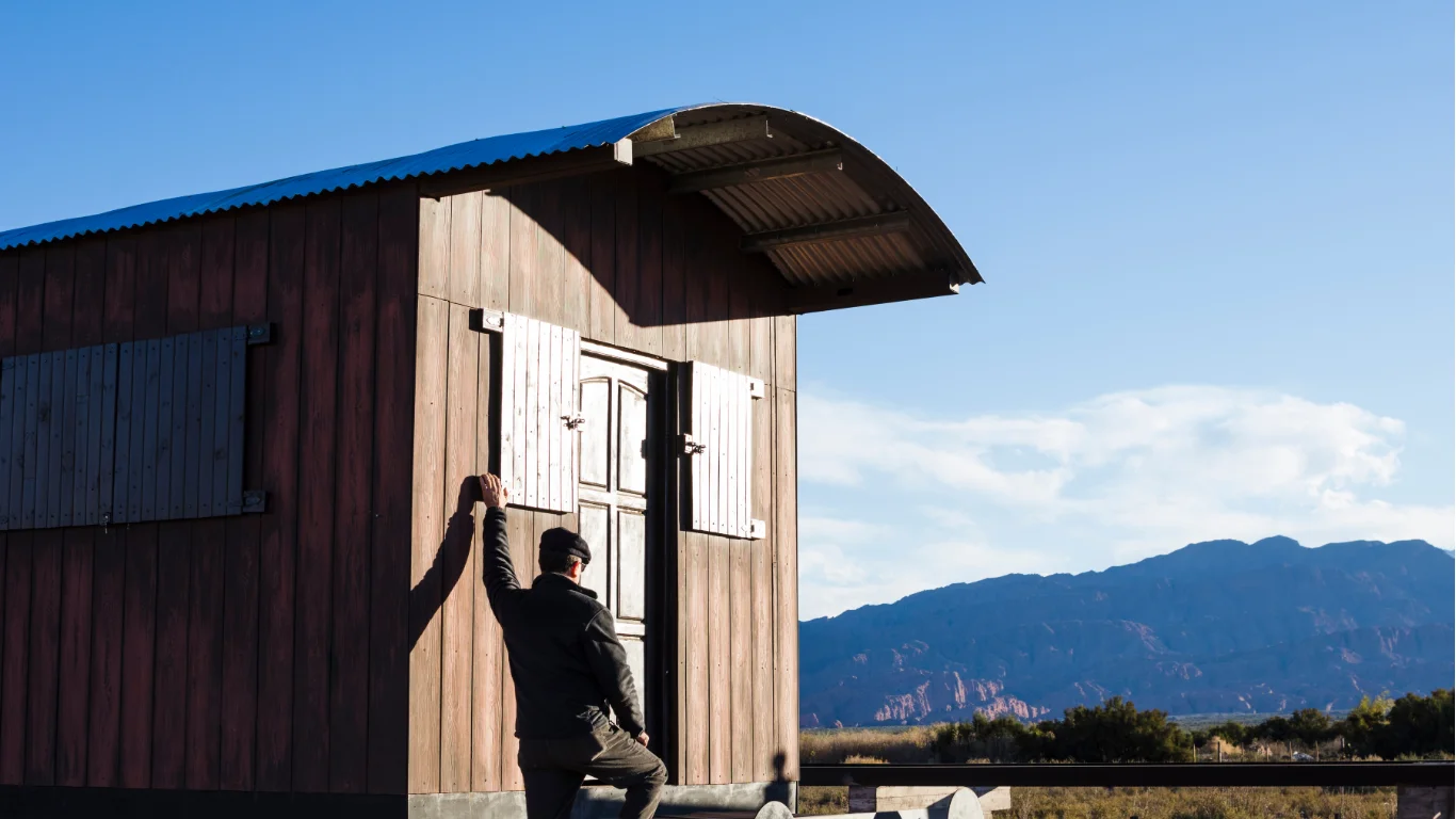
- Warm Mahogany: A rich red-brown with a timeless feel. It adds depth and drama, especially in gathering spaces like dining rooms or libraries. It also looks elegant on trims or smaller decor pieces when used sparingly.
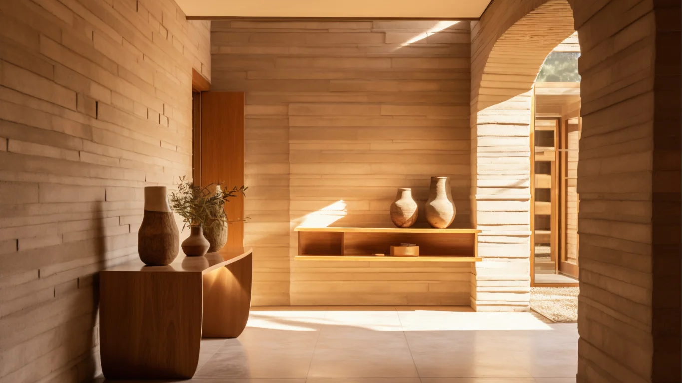
- Special Walnut: A classic wood stain shade that brings natural warmth. Perfect for wooden furniture, flooring, or architectural details. It enhances grain and texture without demanding attention.
- Epernay: A soft ochre-yellow with mineral hints. Muted and gentle, this shade lends itself to spaces seeking understated richness—mudrooms, kitchens, or accent walls.
How to Use These Colors in Your Home
Here are ideas for applying 2026’s trending colors in ways that enhance your space:
- Use one of the bold shades (like Warm Mahogany or Hidden Gem) as a focal point—an accent wall, a piece of furniture, or in textiles. Let the surroundings be subtler so the contrast shines without overwhelming.
- Balance greens or wood tones (like Warm Eucalyptus or Special Walnut) with lighter neutrals or whites to avoid the space feeling too dark. Light hardware, natural light, and glossy or reflective accents help maintain brightness.
- Neutrals like Melodious Ivory work well for larger areas—walls, ceilings—and create calm zones. Use textures (woven rugs, linen curtains, wood trim) to bring in warmth and avoid monotony.
- If you love variety, mix tones: for instance, a room with Warm Eucalyptus walls, Melodious Ivory trim, and accents in Special Walnut or Mahogany for furniture. This layered approach adds interest without chaos.
What These Trends Signal
The 2026 color trends reflect a shift in what people want from their homes. Instead of stark minimalism, there’s more emphasis on comfort, nostalgia, and connection to nature. Earthy greens, wood tones, and warm neutrals are favored. Rich colors are not just bold, but thoughtful—used in moderation or in design details rather than overwhelming spaces.
These picks suggest designers believe people are craving environments that feel restorative and expressive—rooms where one can relax, feel grounded, and still enjoy style.
Conclusion
Colors of the Year for 2026 are all about balancing vivid tones with soothing neutrals. Whether you lean toward deep, moody hues like Warm Mahogany or prefer soft neutrals like Melodious Ivory, these shades will help shape interiors that feel both personal and calming. Use them confidently—accented, layered, or draped across your room—and you’ll stay ahead of trends while creating a home that feels deeply yours.
FAQs
Which 2026 color of the year works best as a wall color?
Soft tones like Melodious Ivory or Warm Eucalyptus are ideal for walls; they offer calm and flexibility, especially in smaller or dimmer rooms.
Can rich colors like Warm Mahogany be used safely in bright spaces?
Yes. In rooms with good natural light, these tones add coziness and depth. Use them on one wall or in furniture/accents to avoid overpowering.
How can I pair these trending colors with existing decor?
Start by matching undertones—warm shades with warm woods or golden hardware, cooler ones with metals or lighter woods. Incorporate accent pieces in trending tones to test the look before committing.
Are these color trends only relevant for paint, or do they matter in fabrics too?
They definitely matter in fabrics, rugs, curtains, upholstery, and finishes. Using trending hues in textiles is a great lower-commitment way to update a room.

